
Transforming a plain-Jane wallflower widget into a thing of beauty….
I know some of you will read this and think, “Widget makeover?” Who is worried about widget makeovers when I haven’t even got a handle on this widget thing-a-ma-jiggy in the first place?”
Ah yes. But that’s why I’m here. By sharing with you my angst and dissatisfaction you too will see the holes and quite possibly leapfrog up to a much higher creative level. Nitpicking and seeing where some things miss the mark, and could be so much better, is a skill I’ve honed admirably over the years. It’s second nature to me, and many creative directors and designers, to poke at things and say,“Well, yes it’s good¦ but if you just changed this, this and that — oh it could be so much better!”
This desire for the best touches all aspects of my life¦ I routinely drive my partner/husband nutty by sending back food or wine in restaurants. But, hey I figure I’m doing them a favor. You know what they say… That your most critical customers are your best; Because they care enough to complain in the hopes of making things better.
BEFORE: THE DULL REALITY
So, onto this exciting Widget Makeover. In June we showcased 4 creative content sites we produce as a lineup of four widgets. I thought it was fun using a new toy to push content out there for viewers to see and interact with. No longer would people go to our website and wonder,“What is the James Gang up to these days. It’s obvious. No surfing or drilling required. Right there, plain as day, in your face what we are up to. The widget line-up achieved that goal.
But then… Dissatisfaction took hold. A tiny doubt was tickling my consciousness that maybe some of our widgets were handsomer than others¦ I looked at our row of widgets with a cold, critical eye. And one was falling short, sadly. I almost zapped it immediately, but I steadied my delete finger and pondered the big question. “Why is the Franke James environmental widget lacking? Why am I unhappy with it?
I didn’t have to think too hard before I realized the drastic disconnect between the intensely visual site content and this sterile little widget. It could be an accountant’s site! Scroll back up there and see if you agree that my widget was desperately in need of a Makeover.
See? Just RSS text on a white background. Basic. Boring. Blah! The site is so much more exciting and so much more visual than this widget is making it out to be. And that little icon logo up at the top is just too inconsequential to matter. Indeed, when I compared it to our Verbotomy widget, (see on the right) which my programming partner Bill James had made, it paled in comparison. Mine was a plain-jane wallflower in the world of widgets. And that is not what the site is about.
I was suffering from a self-image disorder… I could not stand the reflection! I had to have my own visual widget. But how and where? Well, I didn’t want to just copy my partner so I researched some alternative visual widgets.

Did you know that Slide.com is the most popular widget site on the web? comScore has just launched a new service to track widget traffic. Photo-based widgets aimed at personal bloggers and social networking sites are the leaders in the widget world. A quick glance at their results, shows that Slide.com totally whipped their competitors with 117 million users in April alone. RockYou.com came in second with its slick widget that allows you to add music, motion and photos. These fun toys are helping both sites to grow rapidly and attract huge audiences. Interestingly widget penetration is highest in North America, where 40% of users visited a site which featured widgets.
Now a reality check here… Although big players like AOL icons Ted Leonsis, Steve Case and Miles Gilburne, as well as venture capital money is flooding into the space, nobody has figured out how to directly monetize the widgets (except perhaps designers and ad agencies who can create viral widget ad campaigns). As we know, cool widgets are excellent at spreading the buzz and building communities quickly — so if you can monetize the traffic you’re happy.
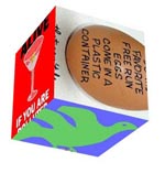
But Slide.com’s nifty widgets didn’t do it for me. Pictured below are two samples of www.frankejames.com widgets made using Slide.com (smaller than actual size).
While they are both dazzlingly handsome widgets, (if I do say so myself) I worry about hogging so much CPU and slowing down people’s computers… The spinning cube one is undeniably cool but does it communicate the message of each post better for the spin? I think not. Now, if I was speaking to Slide.com’s Marketing managers I’m sure he/she would be having apoplectic fits and yelling at me, “You’re not our target market! Slide widgets aren’t meant to be used this way and certainly not for RSS! They are for personal blogs, and social networking sites like Bebo.com where everybody is sharing their coolest photos.”
And of course, I’d have to agree with them. Me using them is just Wrong, Wrong, Wrong! But it was fun to experiment and see what they could do. And I never like being told I can’t do something, so I may just find a use for them.
I returned to lusting after the visual www.Verbotomy.com widget. I wanted one too — badly. So, I asked Bill, “How do you put a picture in the widget? Is this something I can do using Springwidgets or do I need Widgetbox?”
Like many programmers do, Bill rolled his eyes and cloaked his knowledge in secret-programming-speak muttering something about php, and databases pulling single pages, and complex widget schedules. My eyes glazed over but not before I asked him to please make me one.
BEFORE AND AFTER: THE REVEAL
| BEFORE |
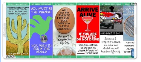
AFTER |
The Makeover was a success. The widget is bouncier and more vibrant than ever and it didn’t hurt a bit… On the left you can see the plain-Jane ‘BEFORE’ version, and on the right, the ‘AFTER’ widget made using Widgetbox (both are live and plugged into this post). While I could not have done the database programming (clearly my education is lacking), the ability to preprogram a schedule and link it to any post is quite a nice feature. Now people who have signed up for My Green Conscience via Widgetbox get the visual widget for their site or desktop. And people who have only signed up for the RSS, get the post delivered as an HTML feed by Feedburner. It’s a great system. Easy to use. I love it!
And sensing that Springwidget aficionados are probably getting a little irate now that I seem to be dissing them in favor of Widgetbox, I will admit that you can make a handsome visual widget with Springwidgets, too. It is flash-based, and for some people it may just do the trick. (It looks virtually identical to the WidgetBox one on the right but is created using Flash.)
Now it’s your turn…Which widget do you prefer? The Before or the After? I have to admit, for some sites, the wallflower may be more appealing and more appropriate than the colorful, in-your-face version. And the beauty is this… I know which one I like better. But you can have either one. Just click on the link under the widget to download the code.
Let me leave you with this one thought which is from a posting about the popularity of widgets with teenagers — and thus points to the tremendous opportunity in the widget marketing space…
‘Widgets have so much buzz now and every advertiser wants to do a widget,” says Marc Fireman, head of digital media for Reebok…’
Franke,
This is Don from SpringWidgets.
Speaking on behalf of SpringWidgets aficionados everywhere, and the SpringWidgets team, we’re not irate at all… We prefer to take things in stride, and then improve our offering based on the feedback 🙂
I’d like to invite you behind the curtain to discuss some of the plans that we have and get your opinions on what we can do to add in some of that “Bounce” that you mentioned…
My email is added to this response and I hope to hear from you soon.
Cheers,
-Don
Just wanted to say, I don’t really understand your comparison. The first widget is bland, (the header choice is rather quiet and there are no images in your posts) but it actually has content that your users can utilize. The second choice is really just a banner ad that has been “widgified”. This really isn’t a comparison between a better widget and a worse widget, but a comparison between content distribution and an graphical advertisement.
laniluau,
You raise an interesting point. However my perspective (And I am speaking as an artist) is that the graphical posts ARE the content and are actually more complete than the snippet of post that the text-based widget delivers. Now I could choose to insert the entire post into the widget, but my thinking is that if people are interested they will click to read the entire post.
In the case of the visual widget, viewers do not usually need to click on the widget to understand it. If you go to my site and look at the full range of My Green Conscience posts you will see that all of them have dominant images — and some of them are followed by text.
What I really love is that this visual system using WidgetBox is very flexible and I can basically do whatever I want. If I want to make the image smaller and allow more room for text I can do it. If I want to fill up the entire widget with the image that’s okay too.
Re: your ad comment: From a Marketing point of view almost all widgets are ads for the content they are delivering. Even if you never visit the site.
I appreciate you leaving a comment!
Franke