Is ‘Hope’ the new hot button?

slice of geography of hope book cover

As an artist, marketer and environmental activist, I’ve been asking myself lately, “How do we move more people to action? Is it through fear? If they imagine a scary future will they act now? Or is it by planting seeds of hope? Is ‘Hope’ the new hot button that will galvanize the world to take action?”

Money and celebrities trump humanity’s survival

Many people are becoming numb to the world’s problems, and retracting into their cocoons. Something that brought that fact into sharp focus for me was this… As I flipped through the newspaper looking for something interesting to read, this headline caught my eye: “Humanity’s survival at stake: UN”. It announced the UN’s 572-page report, Global Environment Outlook.

Hmmm. Isn’t that curious? Humanity’s survival at stake is not front page news! The front page stories were about the soaring loonie (the nickname for the Canadian dollar) and a hot, young hockey phenomenon, John Tavares.

Does humanity’s future being bumped by the loonie and a fledgling hockey star sound loony to you? I don’t know… It must be a defensive play to sell newspapers. The editors know the public can only take so much bad news before we shut down and lose all hope. So they push in our faces the stories they think we really care about. Money and celebrities trump humanity’s survival.

The frog in a pot of boiling water

frog photo and drawing by franke jamesAt times, I fear we are like the proverbial frog in a pot of boiling water. The story goes like this… If you throw a frog into a pot of boiling water, it will jump out. But if you place a frog in a pot of warm water and gradually turn up the heat, it will very happily boil to death. Because the frog’s survival instincts are only triggered by sudden changes. And so it is with climate change. We’ve heard many warnings about climate change over the past 30 years, but somehow we are deaf to them, and unaware of our impending doom.

Pitching Hope to Solve World Problems

geography of hope book cover

Well, clever marketers, artists and writers sense the water is getting a bit too hot, and are serving up the solution. This new crop of “Hope products” could be just what the world needs to inspire action and jump out of the pot.

So where am I seeing evidence of hope? Seemingly disconnected dots have started joining up and a pattern is emerging… Is it a trend? In the past week I’ve been to a book launch for Geography of Hope (which gives us hope by showing signs of a sustainable future unfolding around the world). I also attended Chest of Hope, an art exhibit raising funds for cancer research (which rekindles the hope that cancer can be beaten if we all pitch in and contribute to medical research). Hope is an emotion that savvy Breast Cancer fundraisers have used for many years. Even the packaging on my favorite whole wheat bread features the familiar pink ribbon and a Harvest of Hope campaign to raise money for the cause!

Chest of Hope, 3 sculptures by Christa Gampp

But hope is too powerful a force to be owned by any one cause. Marketers know that hope sells — and some would argue (me included) that the environmental movement could motivate more people by injecting ‘hope’ into their message. Humanity’s survival is at stake — but too many people are tuning out the message. How are we going to flip this around? Personally, when I read about a successful green project it inspires me and gives me hope that perhaps my efforts are not wasted.

Hope as an inspirational force

Hope as an inspirational force is springing up everywhere. I also read news articles about actress Hilary Swank and shoe/clothing designer Kenneth Cole who have jumped on the hope bandwagon. Each promises to tell us how to achieve our dreams (if we buy tickets to their Power Within events in Vancouver and Toronto).

Swank offers hope to young women, “I feel like there’s not a lot of great women role models for girls. If a girl can see my story and somehow say, ‘Hey you know what, I’m NOT going to give up on my dream’ … then I am going to continue to tell my story.”

Cole offers hope to business people when he talks about his company’s efforts which have funded AIDS research and anti-poverty initiatives, “What I’m doing is taking a business that exists and somehow connecting it to a bigger purpose; it wins on every level.”

And this morning’s paper offered more hope in the form of a new book: Jean Vanier, Our Life Together. Vanier is the Founder of L’Arche, the international network of homes for people with disabilities. Vanier urges students to keep “hoping and dreaming.. the important thing is to go ahead and do it.” His message to students is to have the courage to do something different with their lives, “We don’t have to be doing what everyone else is doing… We don’t have to be like a bunch of cows or sheep.”

I say, “Amen to that!”

The common element in this cornucopia of new products — which all pitch different causes — is that they are selling hope that is backed up by action and offer doable solutions. They are giving us a glimpse of a hopeful future. (Listen to Turner’s podcast on CBC.ca for more inspiration.)

But the dilemma is we need a lot more Vanier’s, Turner’s, Gampp’s, Swank’s and Cole’s to get us to wake up and jump out of the pot!

The big question is: Are you ready to take action? Can you plant a few seeds which will offer the world hope? Franke james photo of jumping frog

——————-

© 2007, Franke James,MFA


Creative Commons License

This work is licensed under a
Creative Commons Attribution-Noncommercial-No Derivative Works 2.5 Canada License.

Widget Makeover Project

Transforming a plain-Jane wallflower widget into a thing of beauty….

I know some of you will read this and think, “Widget makeover?” Who is worried about widget makeovers when I haven’t even got a handle on this widget thing-a-ma-jiggy in the first place?”

Ah yes. But that’s why I’m here. By sharing with you my angst and dissatisfaction you too will see the holes and quite possibly leapfrog up to a much higher creative level.  Nitpicking and seeing where some things miss the mark, and could be so much better, is a skill I’ve honed admirably over the years. It’s second nature to me, and many creative directors and designers, to poke at things and say,“Well, yes it’s good¦ but if you just changed this, this and that — oh it could be so much better!”

This desire for the best touches all aspects of my life¦ I routinely drive my partner/husband nutty by sending back food or wine in restaurants. But, hey I figure I’m doing them a favor. You know what they say… That your most critical customers are your best; Because they care enough to complain in the hopes of making things better.

BEFORE: THE DULL REALITY

So, onto this exciting Widget Makeover. In June we showcased 4 creative content sites we produce as a lineup of four widgets. I thought it was fun using a new toy to push content out there for viewers to see and interact with. No longer would people go to our website and wonder,“What is the James Gang up to these days. It’s obvious. No surfing or drilling required. Right there, plain as day, in your face what we are up to. The widget line-up achieved that goal.

But then… Dissatisfaction took hold. A tiny doubt was tickling my consciousness that maybe some of our widgets were handsomer than others¦ I looked at our row of widgets with a cold, critical eye. And one was falling short, sadly. I almost zapped it immediately, but I steadied my delete finger and pondered the big question. “Why is the Franke James environmental widget lacking? Why am I unhappy with it?

I didn’t have to think too hard before I realized the drastic disconnect between the intensely visual site content and this sterile little widget. It could be an accountant’s site! Scroll back up there and see if you agree that my widget was desperately in need of a Makeover.

See? Just RSS text on a white background. Basic. Boring. Blah! The site is so much more exciting and so much more visual than this widget is making it out to be. And that little icon logo up at the top is just too inconsequential to matter. Indeed, when I compared it to our Verbotomy widget, (see on the right) which my programming partner Bill James had made, it paled in comparison. Mine was a plain-jane wallflower in the world of widgets. And that is not what the site is about.

I was suffering from a self-image disorder… I could not stand the reflection! I had to have my own visual widget. But how and where? Well, I didn’t want to just copy my partner so I researched some alternative visual widgets.

Did you know that Slide.com is the most popular widget site on the web? comScore has just launched a new service to track widget traffic. Photo-based widgets aimed at personal bloggers and social networking sites are the leaders in the widget world. A quick glance at their results, shows that Slide.com totally whipped their competitors with 117 million users in April alone. RockYou.com came in second with its slick widget that allows you to add music, motion and photos. These fun toys are helping both sites to grow rapidly and attract huge audiences. Interestingly widget penetration is highest in North America, where 40% of users visited a site which featured widgets.

Now a reality check here… Although big players like AOL icons Ted Leonsis, Steve Case and Miles Gilburne, as well as venture capital money is flooding into the space, nobody has figured out how to directly monetize the widgets (except perhaps designers and ad agencies who can create viral widget ad campaigns). As we know, cool widgets are excellent at spreading the buzz and building communities quickly — so if you can monetize the traffic you’re happy.

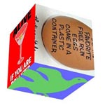
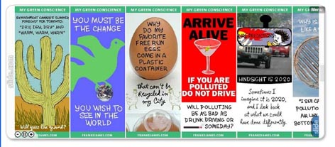
But Slide.com’s nifty widgets didn’t do it for me. Pictured below are two samples of www.frankejames.com widgets made using Slide.com (smaller than actual size).

While they are both dazzlingly handsome widgets, (if I do say so myself) I worry about hogging so much CPU and slowing down people’s computers… The spinning cube one is undeniably cool but does it communicate the message of each post better for the spin? I think not. Now, if I was speaking to Slide.com’s Marketing managers I’m sure he/she would be having apoplectic fits and yelling at me, “You’re not our target market! Slide widgets aren’t meant to be used this way and certainly not for RSS! They are for personal blogs, and social networking sites like Bebo.com where everybody is sharing their coolest photos.”

And of course, I’d have to agree with them. Me using them is just Wrong, Wrong, Wrong! But it was fun to experiment and see what they could do. And I never like being told I can’t do something, so I may just find a use for them.

I returned to lusting after the visual www.Verbotomy.com widget. I wanted one too — badly. So, I asked Bill, “How do you put a picture in the widget? Is this something I can do using Springwidgets or do I need Widgetbox?”

Like many programmers do, Bill rolled his eyes and cloaked his knowledge in secret-programming-speak muttering something about php, and databases pulling single pages, and complex widget schedules. My eyes glazed over but not before I asked him to please make me one.

BEFORE AND AFTER: THE REVEAL

BEFORE

Get this widget!

AFTER

The Makeover was a success. The widget is bouncier and more vibrant than ever and it didn’t hurt a bit… On the left you can see the plain-Jane ‘BEFORE’ version, and on the right, the ‘AFTER’ widget made using Widgetbox (both are live and plugged into this post). While I could not have done the database programming (clearly my education is lacking), the ability to preprogram a schedule and link it to any post is quite a nice feature. Now people who have signed up for My Green Conscience via Widgetbox get the visual widget for their site or desktop. And people who have only signed up for the RSS, get the post delivered as an HTML feed by Feedburner. It’s a great system. Easy to use. I love it!

And sensing that Springwidget aficionados are probably getting a little irate now that I seem to be dissing them in favor of Widgetbox, I will admit that you can make a handsome visual widget with Springwidgets, too. It is flash-based, and for some people it may just do the trick. (It looks virtually identical to the WidgetBox one on the right but is created using Flash.)

Now it’s your turn…Which widget do you prefer? The Before or the After? I have to admit, for some sites, the wallflower may be more appealing and more appropriate than the colorful, in-your-face version. And the beauty is this… I know which one I like better. But you can have either one. Just click on the link under the widget to download the code.

Let me leave you with this one thought which is from a posting about the popularity of widgets with teenagers — and thus points to the tremendous opportunity in the widget marketing space…

‘Widgets have so much buzz now and every advertiser wants to do a widget,” says Marc Fireman, head of digital media for Reebok…’